Note
Click here to download the full example code
Splice dataset visualization
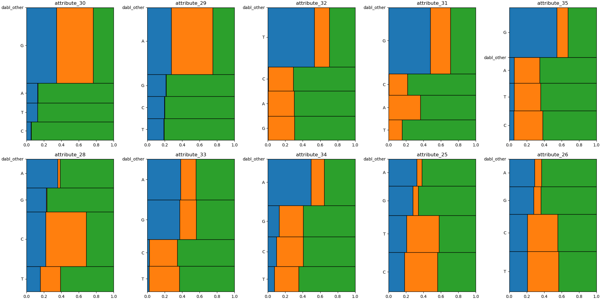
A nice illustration of the mosaic plot.
Out:
/home/circleci/miniconda/envs/testenv/lib/python3.7/site-packages/sklearn/datasets/_openml.py:372: UserWarning: Multiple active versions of the dataset matching the name splice exist. Versions may be fundamentally different, returning version 1.
" {version}.".format(name=name, version=res[0]['version']))
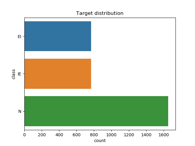
Target looks like classification
Showing only top 10 of 60 categorical features
# sphinx_gallery_thumbnail_number = 2
import matplotlib.pyplot as plt
from sklearn.datasets import fetch_openml
from dabl import plot

X, y = fetch_openml('splice', as_frame=True, return_X_y=True)

plot(X, y)
plt.show()
Total running time of the script: ( 0 minutes 4.503 seconds)